Feedback Corner: The User Interface

Feedback Corners: An Intro

Today we’re experimenting with a new format!

The idea behind Feedback Corner threads is to focus on a subject the team has received feedback on, discussed, and has substantial commentary to offer in response.

The primary distinction between Feedback Corners and Developer Blogs is that the latter will typically outline plans we’ve had for a significant period of time, whereas Feedback Corners are intended to be (relatively) prompt responses to community discussion.
 

Feedback We Have Received

The inaugural Feedback Corner will focus on the User Interface (“UI”). While the UI has been the subject of criticism periodically in the past, about a month ago we saw an increase in feedback regarding the UI, so we wanted to take a moment to address the topic.

Concerns which have been raised include;

  • It being overly plain; the UI is serviceable, but doesn’t feel finished.
  • Some UI elements (e.g. windows & log in buttons) being too large.
  • The aesthetic not living up the grim, dark fantasy of most ARPGs.
  • The current positioning of the action bar has divided opinion.
     

User Interfaces in Last Epoch

As with the rest of the game, the user interface in Last Epoch will have gone through multiple iterations before we’re ready to officially launch the game in 2020. The current UI made its debut in the pre-alpha demos which we began releasing in the run up to our KickStarter campaign. It wasn’t the first UI the game has had - nor shall it be the last!

As we work hard on the game, occasionally there is a need to take on additional staff to help us realize the game’s full potential. A UI Artist joined the team last month, and since then we’ve been discussing what we would like from our UI. Aesthetically this includes the colour scheme, whether it being immersive is considered a priority, the layout of some elements such as the action bar, along with the general style (“what does a UI in an ARPG look like?”).
 

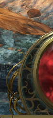
A Preview of What's in Development

As user interfaces are inherently a visual construct, we wanted to delay this post until we could show you a prototype we had developed. This doesn’t mean that what we have so far is final, but that it is representative of the direction our UI is currently heading in. We’d love to know your thoughts - both what you like, and what you’d like to see changed!
 

(Please note that the Support and Store buttons are not yet functional.)

9 Likes

Continue scrolling to see the community’s feedback.

4 Likes

I think the new concept looks really good! But I hope the new UI also includes a clock!

3 Likes

If hadn’t read the post first, I would have said “yeah, the UI seems fine.” After seeing the new menu, I’d say “wow! that looks so much darker thematically and better for it!”

I like that the UI shows a ton of the game and doesn’t take up very much space whence actually playing. I’d only say this should be OPTIMIZED even moar by edging the health bar + squigles closer to the edge of the screen to remove that tiny amount of empty space and to show a tiny amount more of the middle of the screen to me.
Squigles
The actual positioning of the Hotkey bar seems totally fine to me. Don’t see why/how that would be considered bad?!

I don’t care to make too many complaints of the login screen / character screen because I imagine those will be reworked. I like the spinning Last Epoch logo, but dislike so much brightness surrounding. Also I’d like to be able to see my character when selecting them on the character screen (maybe in a dark dungeon environment), but I imagine that’s planned.

Maybe it’s just me, but I don’t really care about all that other stuff other than the game screen during killing stuff - as long as it displays required information clearly (character/stat screen).

2 Likes

That looks much better than what I recall from older builds. I’m looking forward to more. Good job :slight_smile:

1 Like

The only thing I don’t like about the current UI is the shield(I don’t remember what its called) to the left of the health. Its hard to notice imo, it might be better if it just overlaid the hp globe like ES does in PoE.

1 Like

The only thing that I don’t really like about the current UI is the lack of buff indicators. Currently, as far as I can tell there’s no real way to know when you passive buffs have proc’d. Add in some buff icons and I’d be happy with how things are now.

1 Like

I would really appreciate if the new UI would position the health/mana/skills part centered at the bottom instead of the bottom left corner. My main reason for this is that I’m playing on Ultrawide (21:9) and the position in the corner moves the health globe so far to the border of my peripheral vision that it’s hard to get the single most important visual clue in time: when my health get’s low and I’m about to die.

If that’s not going to make it into your default layout, please consider adding an option for it!

Otherwise I very much like the style of the new UI preview, even though it’s really more of a teaser and we don’t see very much yet.

Thanks for the feedback!

I’m not sure if that would make it easier to notice, but I’ll definitely bring this up internally.
 

This is something we’ll definitely be implementing, regardless of the aesthetics of our user interface. It’s just an example of work we haven’t quite gotten around to just yet.

It’s looking good! I’m loving the proposed changes.
One thing that I would suggest is to alter the way potions are presented. At this time, they easily blend in with the overall HP globe.

I’m also in agreeance with the others on the way the Ward is currently implemented. Having it so far to the left it is often forgotten about or maybe not even discovered by a new player until later. I know I spend quite some time playing without even noticing it.

As for capturing the dark, gritty atmosphere. I think this is subjective and can be different from person to person. Diablo 3 and PoE are both considered “dark and gritty” but they have vastly different art styles and gameplay elements. Last Epoch needs to reflect on the overall theme of timelines, etc and leverage that to create their own version and dark and gritty.

Great example Sarno! Loving the work so far!

1 Like

Pretty sure most people don’t think D3 is “dark and gritty” hence the call for D4 art style to change closer in alignment to D1/2.

1 Like

Oh you would be very surprised. New age fans who aren’t familiar with Diablo 2 because it “looks bad” lean towards Diablo 3 as their first hack n slash and since they always heard Diablo is a dark game, they assume D3 is too.

Do I agree? Not really. But the general consensus is what it is and I would love to see an ultra dark game. Brutal, gritty and disturbing.

Heavily agree. Any serious ARPG fan doesn’t think D3 is dark and gritty.

Path of Exile has fairly dark and gritty graphics, but also storyline.
Some good examples of Path of Exile’s atmosphere being dark are all the stories that you can discover if you just go look for them - Piety did human experimentation - Atziri abducted her own citizens to sacrifice them - Karui are cannibals. I really approve of that kind of storytelling, both in style and subject matters.

1 Like

As i already mentioned on discord it would be good if we could scale the UI in the Options (still haven’t checked if that’s already in).
I agree with the others that the ward needs some better visualization.
An Option to change where the Health Globe is located would also be nice.
And as a suggestion, maybe you could add different UI themes, i would like the idea that the UI changes based on the Timeline you are in, like giving it a more greenish look in Ancient Era, a more militaristic look in Warring Gods Era, A Dark/Undead Looking theme in Undead Empire Era, and a Purple/corrupted look in Ruined Era (Can be changed in Options).

So far I really like the changes you shown us, and i am looking forward to whats awaits us on this games journey.
Keep up the good work.

3 Likes

Some random comments about the UI after spending several hours playing in the last few days:

  1. As previously mentioned, having the potion in a different color from health would make it stand out more easily.
  2. I agree that shield is easily lost in the shuffle visually.
  3. Have you given any thought to allowing the user to reposition the control bar as a unit via drag and drop, ala World of Warcraft? Even if it is only repositionable along the X axis, that would be a benefit.
  4. I really wish there were options to increase/decrease the size and color of the cursor. On 3K and 4K displays when running at full resolution, the cursor gets lost, especially when there is a lot of combat going on. I can’t tell where the heck I’m clicking. The antique look of the cursor, while cool, doesn’t have enough contrast to easily spot it in the fray. For those of us on the upside of 50, whose eyesight may not be the greatest (or those with accessibility issues), the ability to adjust size and color of various UI components would be a boon. I realize that’s a tall order.
  5. Is the map overlay (Tab) going to be zoomable (both in and out) or pannable at some point? Right now it’s of minimal use, IMO.

Those complaints aside, the graphics and functionality have increased greatly since Kickstarter. It’s wonderful to see all of the progress… unlike a certain game that I backed which shall remain nameless, that has been in “beta” (really alpha) for approaching a decade.

1 Like

A post was split to a new topic: Pre-alpha UI feedback

4 Likes

Much better, keep up the good work! Are there any updates to the item sheet?

A suggestion I would have for the UI of summons, would be the option to add a toggle to either the skill bar showing how many summons are active or have the top left summoned/buff indicators show when the ability can be used again. Another option would be to allow static positioning of summons icon on the top left corner so you can more quickly assess what summons are present in your roster of minions. When playing on a large screen it is difficult to have to glance at two different corners of the screens while managing combat to see if the summon is either active or at maximum count or whether you can summon again without just needlessly replacing an already present minion.

1 Like

This looks amazing, i love what you did with the UI!
Next is a bar for the buffs and the minions :smiley:
If everything gets this much better in that short amount of time then this game will be HUGE.
Keep up your great work, i love seeing your work.