Hello Travelers,
The Pre-Patch Hype Week continues! In today’s blog post, we’re going to be covering some of the improvements in level design. Everything from the lighting, assets, and layout of the area you’re fighting (or dying) in has a very significant impact on not only the gameplay feeling itself but also immersion. These visual aspects can convey a lot of feeling and emotion behind the meaning of a scene and help establish it within the world, making each scene feel unique and impactful.
The physical layout of different areas is also quite crucial in an ARPG due to how the camera angle works, how movement works, and how players interact with it. As a quick example, ever notice how most maps like to go up and to the right? This is because you have the most visual area in the top of the screen, as well as for many people reading left to right leads to a natural tendency to go right first. Of course, there are exceptions to provide uniqueness, but there are many small rules that go into making maps for an ARPG. But today, we’re going to be covering some of the improvements we’ve been making since 0.8.5, and showcase some of these improved scenes!
Updated Scene Assets
Assets are one of the fundamental aspects of any level design. This may be plant models, surfaces, textures, and a whole host of other things. We’ve been updating scene assets accross Eterra for both better visuals and better performance. Just because something looks better, doesn’t mean it needs to impact performance; this is the balance we’ve been striving for. Assets can also introduce a consistent theme, with specific lighting and atmosphere, areas can be tied together thematically.
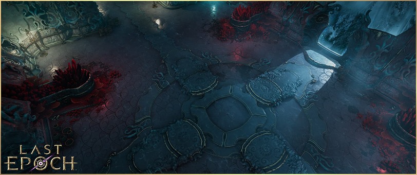
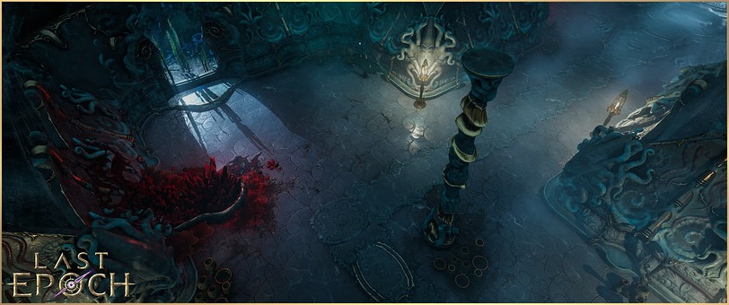
For today’s example, we’re going to be looking at Lagon’s Temple. As a key area housing one of the Gods of Eterra themselves, this beautiful temple has had a lot of attention provided to it with new assets, lighting, and terrain tools. Our level design team has used our newest terrain tools to achieve localized wetness and blend dirt texture into the floor to make the area more distinct and stand out as a whole new experience.
New End of Time Zone
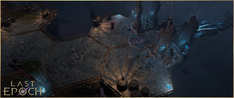
The End of Time is one of the most important zones in Last Epoch. It’s where you achieve one of the largest turning points of your character, it’s where the primary endgame system is housed, and it is, as the name implies, where everything ends up. Previously, The End of Time was not as visually distinct of an area as we would have liked, given its importance in story, gameplay, and as the primary central hub in Last Epoch.
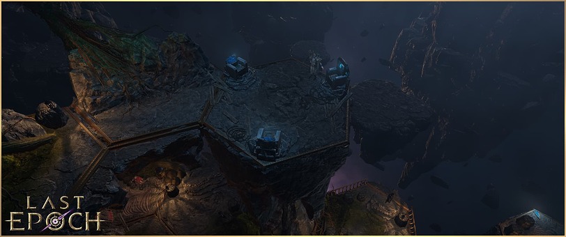
Here we’ve gone through the End of Time, giving it the visual distinctness warranted by its importance. The background as a key part of The End of Time’s identity, which really helps drive home how final it is. We’ve kept the core of it while adding some more fractured elements with islands of reality in the environment to put on display the existence of this place outside of reality itself. Following Patch 0.9, this area will also become one of the primary town hubs, where you’ll be able to encounter other players traveling through their own timelines or yours if you chose to share your timeline with them in forming a party.
Volumetric Lighting
It’s hard to see all the beautiful textures and assets without lighting. However, just having a skybox light and some reflective surfaces doesn’t make an area very engaging. This is where volumetric lighting comes in. In the past, we have used volumetric lighting, but in a minimal way. We’ve improved our tools to be able to use volumetric lighting more globally, keeping visuals consistent no matter where you are in the scene. Instead of having localized god rays, we are now setting volumetric parameters for the whole scene, where light sources can properly react with these volumes, creating more believable fog and atmospherics.
Volumetric systems can also work together with particle systems, like rain, to achieve a dramatic look where the rain is illuminated by other light sources or even thunderstorms. This is a much cheaper (performance-wise) way to create these types of effects compared to having lit semi-transparent particles. For today’s showcase, we’re showing off some of these new volumetric effects, which are in high use on Admiral Harton’s Dreadnaught, where the scene takes place on open water in the middle of a thunderstorm.
We can also use volumetric properties to create visual effects, such as in this ravine. Having thick fog volume illuminated by glowing void assets.
Vegetation Shaders
In the past, we have used several different vegetation shaders for different vegetation assets, but this was causing a number of issues. Consistency between different assets was not great, as they had different shading models, different motions, or even no motion at all. With this, it was hard to maintain and create great-looking environments.
We ended up creating our own vegetation shaders to unify all vegetation in the game. These shaders are optimized for our renderer and how we want to use vegetation now or in the future. Because this is a solution we made for us, the system is less expansive and focuses more on what we need. Meaning vegetation not only looks better, but also generally resulted in improving performance of these shaders across the board. It also means vegetation is now consistent with the same shading and lighting models.
This also gives us a set of unified controls that allow us to achieve new effects previously not possible! This means we can have rolling winds, gusts, gales, light breezes, and everything in between able to affect all the vegetation consistently. Imagine tiny grass, tall trees, and bushes all able to be controlled by in-game wind. It’s very exciting, and you will see many of these effects coming in patch 0.9!
A new view
With new scene assets, volumetric lighting, and vegetation shaders at our disposal, we’re bringing the world of Eterra to life in a much more immersive way. Patch 0.9 will bring these improvements and more to many zones in Last Epoch during the Convergence update on March 9th, and you can look forward to more scenes receiving these improvements on our road to 1.0.
Farewell for now Travelers, and we’ll be back soon with another hype week blog post for our next look at our upcoming Multiplayer Beta - Convergence!
