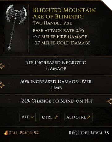
General Appearance

Item Comparison
Alt Tooltip
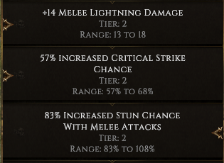
Affix Tiers & Ranges
Rarity Glow
Unique items, Legendary items, and Set items will have glowing tooltips!
General Appearance

Item Comparison
Alt Tooltip
Affix Tiers & Ranges
Rarity Glow
Unique items, Legendary items, and Set items will have glowing tooltips!
looks a little bit fancier even tho i dont completely understand the need for it. tbh there are some other grapfical UI elements that are much more important to get some work done imo.
Tbh, making people paying 35 euro for a 10% finished game, is not good, specially for players, then showing us minor UI/graphics change periodically let us hope, but look at this poste, 70 view, 1 like, 1 answer… And on twitch, 1-5 viever average per day… I dont hope so, but game is dying atm, even before being fully born
First, to the topic, I think the look of the new tooltip is a lot better aesthetically and because it clearly shows the item in question which matters when crafting.
Beyond that to @Dabnoj, personally I think you’re completely wrong. Its super late after beta and no ladder resets or major patches. This is the slowest time for any game. Especially one in a pay wall beta.
While this post isn’t exactly exciting, its just a small update. No need to shit on it. At least watch for the patch notes to respond about their overall progress. Typically their patch notes have a lot more improvements than even those mentioned in a preview. You also failed to mention all the other things they are working on even in the patch preview.
This is a boot strapped funded indie game. Did you play path of exile early beta? All they had was piety and then eventually Dominus quite a while later. People payed plenty of money to play it despite it being free to play. Look at what path of exile became.
I think you’re acting entitled and spoiled. The 35 dollars is to support the development of the game in the future. You also get the exact value invested in micro-transaction points. I get I’m being quite a bit ornery and if you want to fire back at me feel free. But I think it’s completely unfair to blame the devs and accuse the game of dying. Especially when you have zero data other than the most recent twitch views. Which I think is ridiculous to begin with. Do you expect a game in early beta with no advertising behind a paywall late ladder reset and with no recent major updates to get a lot of twitch views? I certainly don’t. It would be like comparing a fresh major patch release in PoE to 3 months later when the season is almost over. Sure the scale is much smaller in Last Epoch but its the exact same thing. You could easily cry that PoE is “dying” at that point in almost every season.
The communication/update rate for Last Epoch has been at least as good or better than any other independently produced game on the market. Period. And this is coming from someone who I would imagine Sarno probably doesn’t even like:P
On that note it would be nice to at least see screen shots of what the various alt, ctrl, alt+ctrl functions look like after being displayed. Common Sarno;) =D
They’re working on those too:)
I must remind that you don’t pay for a game. You pay for a supporter pack which includes the game . The game will be available at release for 15 euro.
I mean… you support the game in development to make this development possible, right? Don’t get me wrong, we all wish to get good for we paid, but you should fully understand what you’re paying for.
Paying a painter for your portrait you can’t complain about the picture just in the middle of a drawing process ![]() .
.
Best Metapher ever.
Design Looks good, especially for crafting  I would love to see a small T1, T2, T3 on each pre or Suffix side or something, so one can recognize its worth fast for ones crafting agendas!
u can show the tiers with the next patch aswell with ctrl or alt, dont remember. just check the next patch preview. they mentioned that already
Hey everyone!
Some solid feedback here so I’ll quickly run through some of the points you’ve raised;
We do plan on many other improvements to the user interface - and just yesterday we had a session where we took stock of where we are on the game graphically. This entailed looking at UI elements, textures, shaders, lighting, general level design, and more to see what needs to be improved and to make sure that these improvements are ‘budgeted for’ timewise in our internal roadmap. If you’d like to make specific suggestions, I’d suggest creating a new thread in the Feedback and Suggestions section that focuses on UI art that needs to be updated.
So there’s a few topics in this post to address.
The first is that we’ve recently been trying to transition back into posting daily social posts, and unfortunately it simply isn’t possible to have large and impactful changes ready to be announced that frequently. I’d point out that our initial beta release was approximately five weeks ago, and that had a lot of content including multiple new Chapters and new classes. Regularly posting small updates about what we’re working on has historically been met very positively - though if people would like us to stop, we are open to that feedback.
Looking at the thread’s statistics will be a bit misleading due to the forum post about this subject being posted 30 minutes after messages regarding it being sent out on Reddit, Twitter, Facebook, and our community Discord server. This would’ve resulted in the forum post being proportionately less popular than what it would usually be.
Regarding your point about streaming: I’ve just checked Twitch, and at the time of me posting this there are zero people streaming Last Epoch or Wolcen - and I think this is primarily because, when it comes to streaming ARPGs, people spend the majority of that time playing endgame content. Looking at our planned endgame content neither of the Gates of Memorium or Epoch’s Call systems are available yet, and the Monolith of Fate is currently an early iteration of the system. Typically beta access is about being able to try out works in progress and offer feedback which helps shape their development. I can’t think of any examples of games a year out from release which competed with more established games for time played.
Our current plan is that it will be possible to see this information while holding down both the Ctrl and Alt buttons, so it’s available but not always present - which might lead to clutter.
Here’s a preview of what it will look like in our next patch;

With range Scala even! Awesome 
Woot??? ![]() Don’t stop! Your communication is superb. I’m happy about every single bit of information you have to offer.
Don’t stop! Your communication is superb. I’m happy about every single bit of information you have to offer.
Just browse this forum for information about upcoming stuff and previous patches. You will see that your comment is far away from reality. If you have questions about future content and game mechanics you can easily create a post on this forum and probably will get answers from this community or the devs.
The feedback about this game and its progress is very positive on this forum and reddit as well. Just take the time to collect some info by yourself before making this kind of comments.
I still don’t understand one thing. Weapons don’t have some damage range? I see weapon in game and I have no idea, if it will deal more or less damage per hit.
Could you please also share with us the screenshots of the tooltip of this particular weapon for the following cases -
I am interested to see how it looks like for the above cases, a screenshot of the fully expanded tooltip might give a more clear picture of how helpful\not helpful this new design is.
The screenshot that you have shared does look promising to me personally.
We’re getting closer to patch day and wanted to provide the alternate views of the item tooltip design coming in Patch 0.7.1. We’ve also included a screenshot of the rarity glow feature.
I’ve updated the OP, but I’m also posting these separately as our forum skips past posts you’ve already seen. Hope these help tide you over until we release the patch next week!
Item Comparison

Alt Tooltip

Affix Tiers & Ranges

Rarity Glow
Unique items, Legendary items, and Set items have glowing tooltips!

I like it, it looks like there is a ton of information available right from keystrokes in-game.
I almost think we need the tier of an affix listed by default on the top tooltip, just to forestall people posting opaquely good items that require math and spreadsheets to evaluate.
Legendary items incoming next patch confirmed :tinfoilhat:
You paid 35 Euro for a supporter pack with the game when released. I have a feeling you think this game has been released already, which is why you quoted twitch viewership. Let’s be clear, this game is not out yet. This game is still in beta development and will be released in April 2020. This is stated when you purchase said supporter pack. Your understanding of where this game is, is the issue.
Too big, too much text.
I love the look of these, its all laid out nice and clear.