This time im coming after the new (and improved) passive trees. I do like where it going, but I do have some constructive feedback.
My problems with it were:
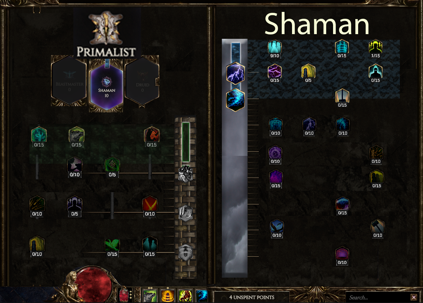
It wasnt very clear how many points away from a new passive tier i was.
Passive trees were very busy with lots of small icons and text
The base class tree was indistinguishable from the specialization trees. They all have tabs and dont feel very clear that they are different specalisations, or that the base class isnt a specialisation.
The background color moving up the screen felt overwhelming
Skills acquired from putting points in look exactly the same as passives
With such a huge amount of passives, its felt crammed into the half a screen it has
Additionally
Alot of the specialisation trees are four ‘lanes’ wide, but only contain three passives or less per tier
There wasnt much ‘flavor’ to each passive tree. It was just. “Here is a tree”, “Here is another tree with slightly different symbols”.
I prefer top down leveling. Call me a D2 fanboi.
SO! I re-imagined them in photoshop. Not pretty, but you get the gist:
Change list
Unified passive window. Now 3 subwindows that open (as a second window) for specalisations.
Passive window titled Primalist to clarify base class
Selected spec. tab highlighed within window, others greyed out if not selected.
Passive Icons made 25% larger
Skill Icons made 50% larger
Ruler substeps added to clarify distance
Background color advance made 30% opacity.
Skills placed into separate flavored bar with looks unique to class and subclass
I don’t think the new trees are that bad. I’m coming into it fresh, so I can’t really compare it. The only thing that took me a second was realizing that certain nodes unlock at X unlocked nodes of that class. Once I put in my first point and I see the bar rise, it all clicked and it was pretty clear.
I kind of like the new UI of the trees, too. However, it was unintuitive at first that you needed to reach 20 points in the base class before putting points in the mastery class. In my case I was confused when I just immediately flipped through the class tabs when I got my first couple of passive points and tried to apply them in a mastery tab’s bottom nodes, and discovering that the points would not be accepted.
However, to the OP, I do really like your visual for the Primalist base class screen. If I was to make a suggestion that would keep it as one screen, the Primalist icon would be its own tab that it defaults to as shown in your image, but clicking any of the mastery tabs below would reconfigure the passive tree below to represent the passives of the mastery class, and change the header (“Primalist” in this case) of the class to the one selected. The Mastery Classes would each have their class image supersized like the Primalist has in the screen you provided. Maybe also have the image glow to indicate which of the four classes’ icon tabs was selected.