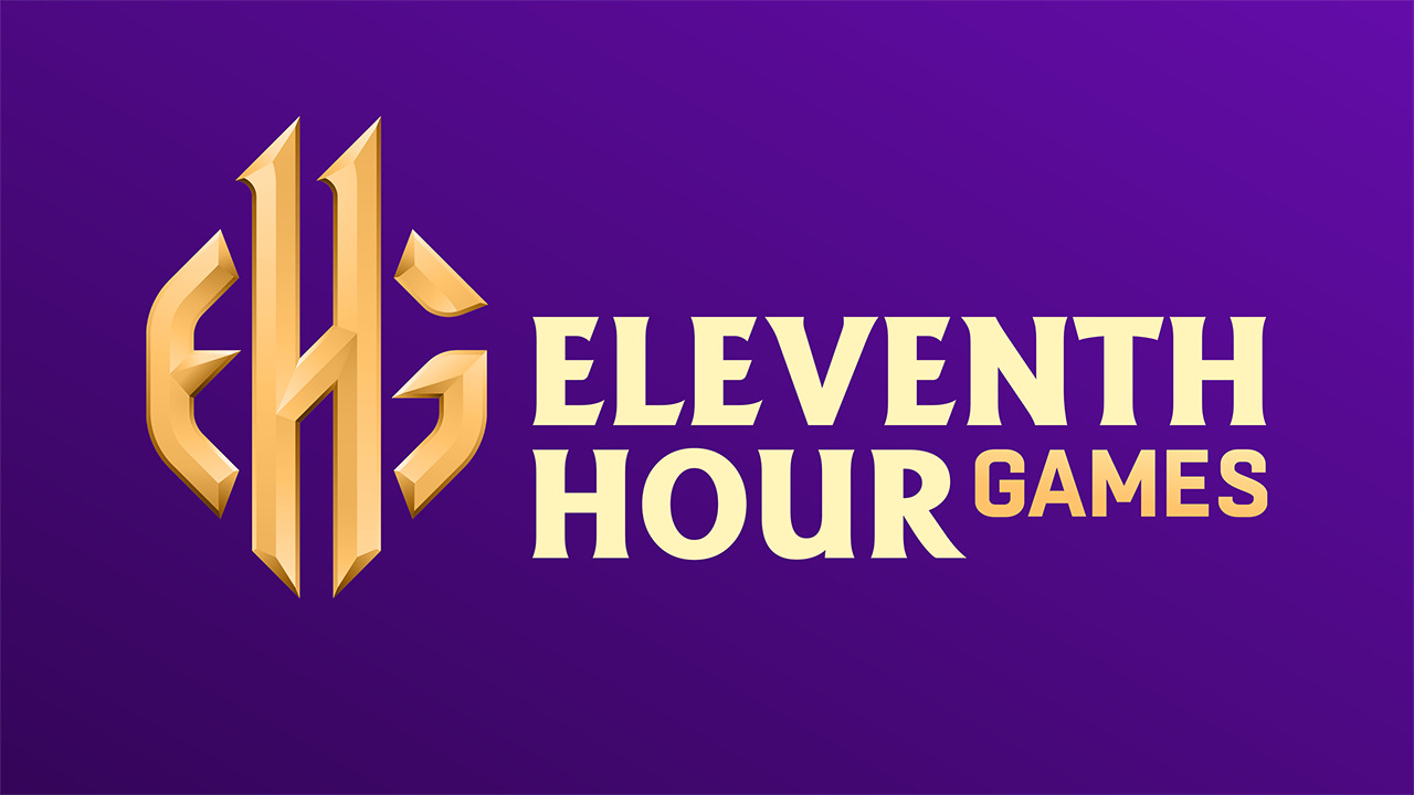
Today we’re excited to unveil our redesigned studio logo.
As some of you may know, Eleventh Hour Games was born of a deep passion for top-down loot-based ARPGs and started by forming a team of like-minded ARPG enthusiasts via Reddit. Our small unfunded team spent every night after our other 9-5 day jobs preparing the groundwork for what would come to be the game that you all know today.
Working at the eleventh hour and pulling off needed accomplishments during critical moments was how we went from a team of around ten enthusiasts to launching a successful Kickstarter. Those achievements paved the way to further successes that enabled us to grow and create an ARPG that can now compete with titles from studios that are much larger in size. Eleventh Hour Games as a name was enshrined to remind us of how a group of passionate enthusiasts came together creating a studio that now spans the globe as we work on Last Epoch remotely.
This new logo brings our number 11 front-and-center as it doubles as the H while giving us a design that is more suited to displaying nicely across the vast number of mediums that are needed. We will proudly display this on merchandise, platforms, and in our homes, reminding us of our underdog roots and the tremendous effort from our beginning team that has brought us further than we thought possible.
Thank you all for believing in us, the inspired group of gamers that took matters into our own hands, and help us go from the after-hours rag-tag team that we were, to a studio that we are confident will provide you quality loot-hunting-entertainment for many years to come.
I really like that the “11” is baked into the “H”, but unfotunately I think its very hard to see what this means if you don’t know the company. The “G” is very hard to read.
Abbreviations are already hard to make something out of, but if you can’t properly read it on top of that it gets even more messy.
It is also a bit too catroon-y for my taste.
So overall I am torn, liek the idea, but not the execution.
I agree with the previous logo packing more punch. Frankly, the new logo seems to be a missed opportunity: it could play around the clock if you excuse the term (as in “11th hour” on an actual clock face), given how time manipulation is one of the central themes in LE.